


The app I didn't need to switch
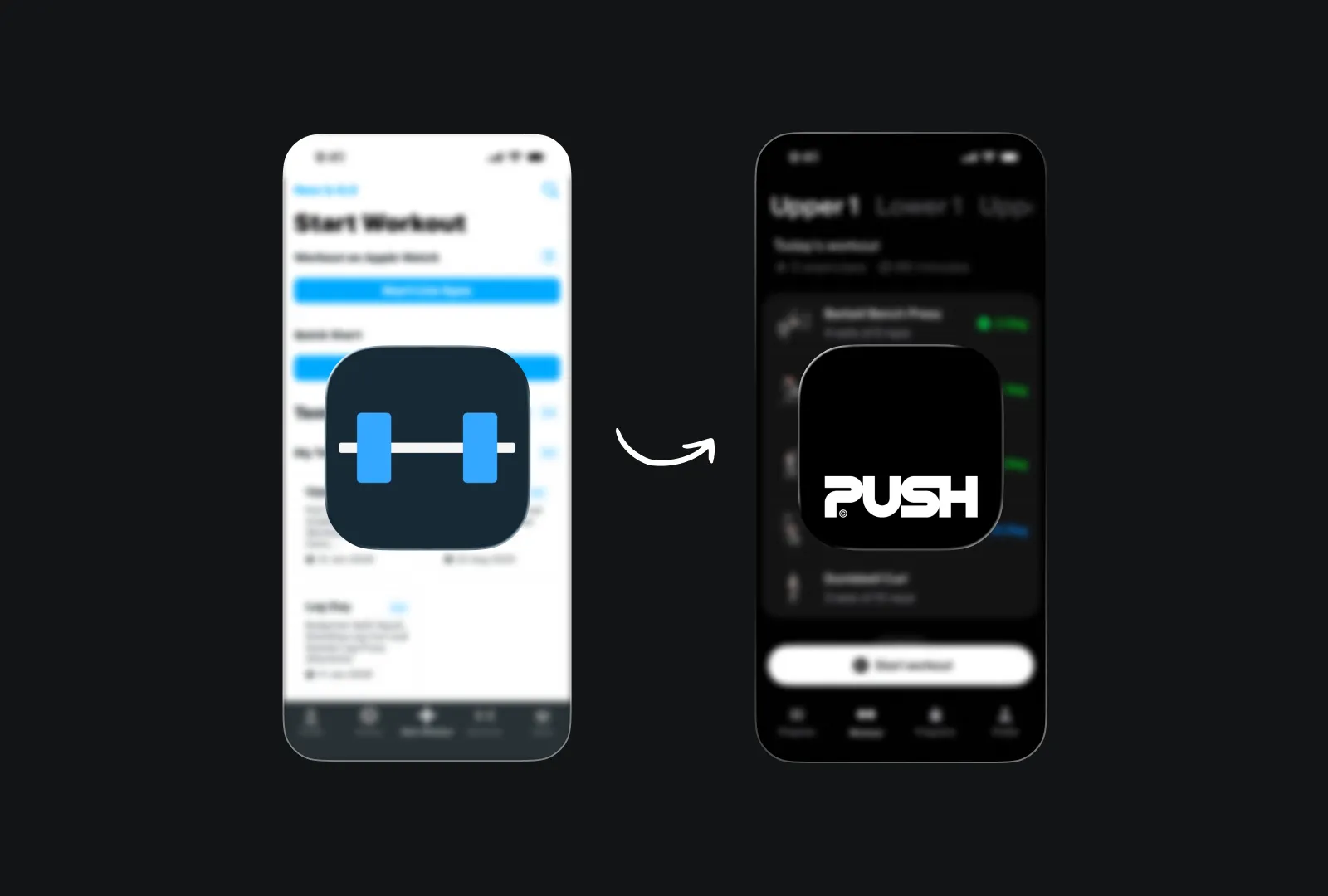
I switched to a new gym app just because it looked better than my old one, guilty as charged. I have been using the app Strong for the past 2 years, it tracked my lifts and logged my progress. It was functional and did everything it’s supposed to.
Then I was introduced to Push. It looked different, and the UI feels like someone cared about me, not to mention it was sooo clean, I loved it, so I made the switch (paid app btw). I thought this was one of my style-over-substance trade, and boy was I wrong.
What I actually got from the switch
I started using it in my workouts, here are some of the fun stuff I discovered:
AI coach that adjust your progressive overload week by week, so no more guess work.
Barbell plate display/indication which should you what plates to put on each side of your barbell for the desired weight, what a thoughtful detail, yet no one has done it before
Shareable summary graphic at the end of every workout, one of them told me I’d lifted four horsed in that workout.
Dynamic activity notification that shows the time left in your rest period
Motion: lots of stuffs move in the app
Form was the signal
Here's what I've come to understand after a few months with it: the aesthetic didn't replace the functionality. It predicted it. When a team cares enough to make something look right, they tend to care about the parts you don't immediately see too. The barbell calculator, the AI coach, the rest timer that actually works with your body instead of against it. These aren't features that happen by accident in an app that looks polished. They come from the same attention.
I thought I was choosing form over function. What I was actually doing was trusting a visual signal that the whole product had been thought through.
Form got my attention. Function made me stay. And honestly, that's how it should work.
I chose form over function, or did I?
Switching gym apps
Switching gym apps


The app I didn't need to switch
I switched to a new gym app just because it looked better than my old one, guilty as charged. I have been using the app Strong for the past 2 years, it tracked my lifts and logged my progress. It was functional and did everything it’s supposed to.
Then I was introduced to Push. It looked different, and the UI feels like someone cared about me, not to mention it was sooo clean, I loved it, so I made the switch (paid app btw). I thought this was one of my style-over-substance trade, and boy was I wrong.
What I actually got from the switch
I started using it in my workouts, here are some of the fun stuff I discovered:
AI coach that adjust your progressive overload week by week, so no more guess work.
Barbell plate display/indication which should you what plates to put on each side of your barbell for the desired weight, what a thoughtful detail, yet no one has done it before
Shareable summary graphic at the end of every workout, one of them told me I’d lifted four horsed in that workout.
Dynamic activity notification that shows the time left in your rest period
Motion: lots of stuffs move in the app
Form was the signal
Here's what I've come to understand after a few months with it: the aesthetic didn't replace the functionality. It predicted it. When a team cares enough to make something look right, they tend to care about the parts you don't immediately see too. The barbell calculator, the AI coach, the rest timer that actually works with your body instead of against it. These aren't features that happen by accident in an app that looks polished. They come from the same attention.
I thought I was choosing form over function. What I was actually doing was trusting a visual signal that the whole product had been thought through.
Form got my attention. Function made me stay. And honestly, that's how it should work.
The app I didn't need to switch
I switched to a new gym app just because it looked better than my old one, guilty as charged. I have been using the app Strong for the past 2 years, it tracked my lifts and logged my progress. It was functional and did everything it’s supposed to.
Then I was introduced to Push. It looked different, and the UI feels like someone cared about me, not to mention it was sooo clean, I loved it, so I made the switch (paid app btw). I thought this was one of my style-over-substance trade, and boy was I wrong.
What I actually got from the switch
I started using it in my workouts, here are some of the fun stuff I discovered:
AI coach that adjust your progressive overload week by week, so no more guess work.
Barbell plate display/indication which should you what plates to put on each side of your barbell for the desired weight, what a thoughtful detail, yet no one has done it before
Shareable summary graphic at the end of every workout, one of them told me I’d lifted four horsed in that workout.
Dynamic activity notification that shows the time left in your rest period
Motion: lots of stuffs move in the app
Form was the signal
Here's what I've come to understand after a few months with it: the aesthetic didn't replace the functionality. It predicted it. When a team cares enough to make something look right, they tend to care about the parts you don't immediately see too. The barbell calculator, the AI coach, the rest timer that actually works with your body instead of against it. These aren't features that happen by accident in an app that looks polished. They come from the same attention.
I thought I was choosing form over function. What I was actually doing was trusting a visual signal that the whole product had been thought through.
Form got my attention. Function made me stay. And honestly, that's how it should work.
More in the details
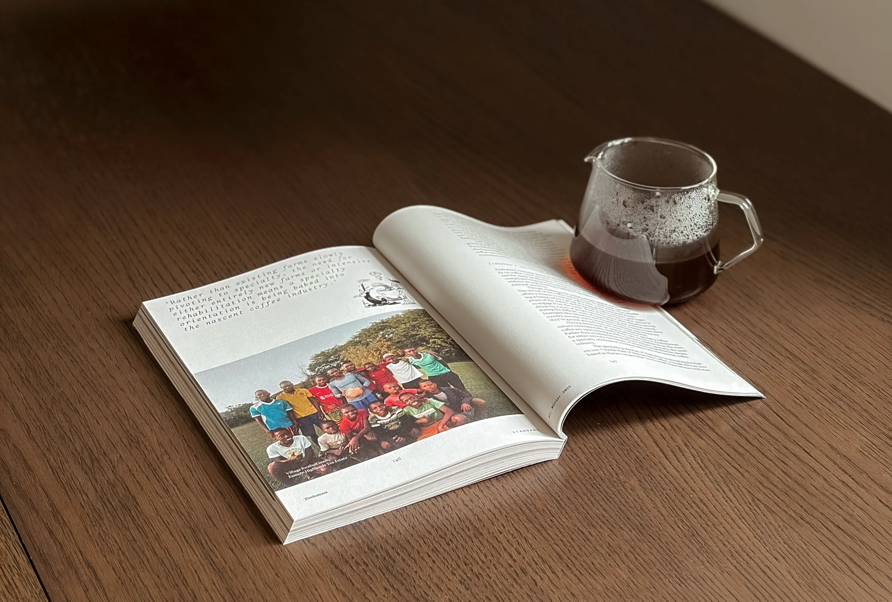
Time for me to touch grass
Taking inspiration from a magazine for my website’s layout
11 May 2026
Time for me to touch grass
11 May 2026
Time for me to touch grass
Taking inspiration from a magazine for my website’s layout
11 May 2026
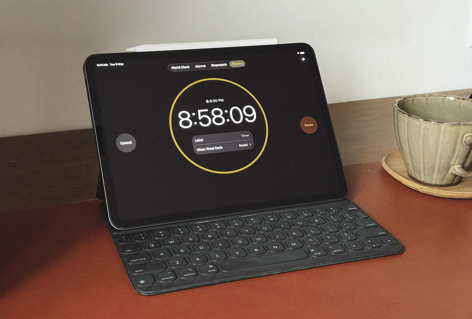
I was working fewer hours than I thought
You probably are doing the same
5 May 2026
I was working fewer hours than I thought
5 May 2026
I was working fewer hours than I thought
You probably are doing the same
5 May 2026
I am never as good as my taste
and that's okay
26 April 2026
I am never as good as my taste
26 April 2026
I am never as good as my taste
and that's okay
26 April 2026
I take on a small number of projects at a time. That's intentional. The work is better for it.
Book a project
You know what you need. Let's make it happen.
Book a consultation
For those who want to understand what their brand needs before committing to anything.